Printing Projects Di-cuts – Print Projects with interesting patterns

By Winn Apple   |   Published April, 2014

Di-cut Marketing Piece

Di-cut Marketing Piece

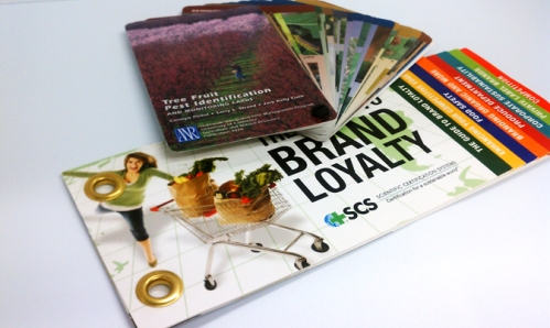
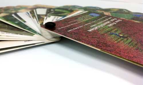
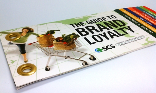
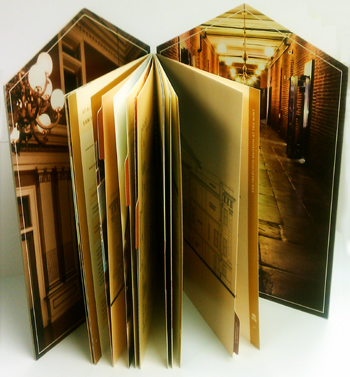
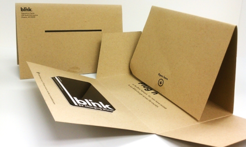
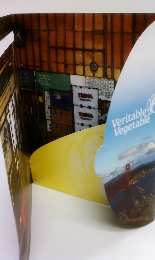
Creating printing projects with a sloped edge and tricky folder pockets is a real craft. There are some clever ways to turn a simple business folder into a show stopper.

article_folder2

Most printers will often have capabilities for simple di-cut projects, like round cornered business cards.

But, if your project calls for something a bit more complex, you’ll want to make certain that your printer has a solid reputation for handling what oft times is an expensive process.

Printers, atleast most, don’t create the di-cuts in-house, but rather send these projects out to di-cutters they work closely with.

The above examples were all beautifully printed here at PrintingGreen / Bacchus Press. We have over 33 years of experience delivering Award Winning Printing.

If you have a print job in the works but need some guidance don’t hesitate to drop us a line or submit a quote request for your more complex printing.

Leave a comment

Filed under Uncategorized

Printing Projects Chicago Screw – Print Projects with Naughty Names

By Winn Apple   |   Published March, 2014

binding_1

Most everyone has atleast seen a printing product, like a booklet, that has saddle stitch, wire-o, or perfect binding. What you may not be as familiar with are Chicago screws.

binding_2

Chicago screws are a non-permanent, albeit nearly impossible to remove, type of print binding. It’s a machine scew that is fastened in a single corner allowing your pages to “fan out”.

Because the pages of your booklet do not lay flat when opened, it is reserved for a very specific type of presentation.

binding_3

An alternative to the Chicago screw are grommets. These are versatile metal rings also used for hanging Banners. As a binding for your brochure, it less cumbersome. It’s somewhat unconventional and on the right printed piece it can be really eye catching.

Because grommets are flatter than a Chicago screw, the pages can flip open rather than fan out. It’s useful for product like Calendars or other printed products that your end user is expected to hang.

The above examples were all beautifully printed here at PrintingGreen / Bacchus Press. We have over 33 years of experience delivering Award Winning Printing. If you have a print job in the works but need some guidance don’t hesitate to drop us a line or submit a quote request for your more complex printing.

Do you have Print Ready Catalog Files? Why not send them to press! Order Now

Leave a comment

Filed under Uncategorized

Awesome Shapes – Print Projects with Unusual Design

Di-cut Marketing Piece

Di-cut Marketing Piece

By Winn Apple   |   Published January, 2013
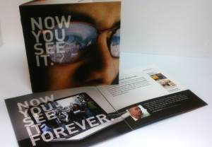
Unconventionally shaped wire-o catalogs and cleverly folded mailers are designed to turn heads. It can be a costly affair to produce complicated print projects, but if done right, you’ll reap the rewards.The mailer featured above is a very tricky shape for multiple reasons. It’s a tricky cut job for one, but assembly requires alot of manual work. A nicely printed and cut job can all be lost with sloppy folding and sealing. It’s such a clever design – one that received loads of attention.

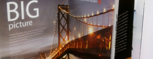
The wire-o book featured here is a fantastic example of unusual designs that pay off. The SF Museum and Historical Society produced the printed pieces for a fund raising event. No doubt it was one heck of a shin dig. The finished product presented beautifully and brought home the Gold for Bacchus Press  in the Visual Media Alliance Showcase of Excellence.

Di-Cut Wire-O Book

Award Winning Printing

If you are planning on designing a with di-cutting involved, make sure you pick the right printer. Most likely the cuts won’t be done in-house but rather sent to a di-cutting company. But you’ll want a professional managing the job properly from beginning to end.
The above examples were all beautifully printed here at PrintingGreen / Bacchus Press. We have over 33 years of experience delivering Award Winning Printing. If you have a print job in the works but need some guidance, don’t hesitate to drop us a line or submit a quote request for your more complex printing.

Do you have Print Ready Catalog Files? Why not send them to press! Order Now

When you print with a Certified Green Printer, like Bacchus Press and PrintingGreen.com, ask for the FSC Certification or Green logo to be added to your Brochure. Let your readers know you care about preserving the health of the planet!

About the Author

In addition to crafting content and blogs, Winn Apple writes short stories and novellas for middle-grade readers. You can find her short stories along with a portfolio on her site, MysticJunkyard.com or on her soon to release website, snugbuggle.com – the best darn place to find short stories for kids.

Leave a comment

Filed under Uncategorized

Printing Projects – Crossovers

IMAG0334
By Winn Apple   |   Published December, 2013

First up, let’s take a look at the world of crossover.

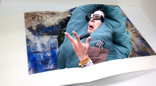
Crossover is a printing term that refers to an image that literally crosses or spans across two pages, also known as a gutter jump.
Jumping a gutter is no simple trick- it takes a real master in printing to line up complex images across a gap and produce a seamless finish.
image crossover
This is especially tricky if your printed piece is a perfect bound catalog or booklet. Some binding options, like saddle stitch, allow a bit more wiggle room.

crossover_3

Because these images span across two pages, lining them up is only part of the difficulty – keeping color consistency is another.

There are no shortage of variables that can effect color consistency – everything you can imagine including the weather can alter the color of a single printing job. So attempting to keep the color of one image consistent when printing along multiple pages requires an adept and focused pressman.

crossover_4

Paper thicknesses can vary slightly depending on the weight. Regardless, each page starting with the outside page and working in, will be farther away than the page preceding it. This too has its own wonderfully colorful term in printing. It’s known as creep.
In order to compensate for the pages “creeping”, the margins or gutter of each page is increased. This moves the image or printed area the degree necessary to allow the images to line up.
The above examples were all beautifully printed here at Bacchus Press. We have over 33 years of experience delivering Award Winning Printing. If you have a print job in the works but need some guidance, don’t hesitate to drop us a line or submit a quote request for your more complex printing.

Do you have Print Ready Catalog Files? Why not send them to press via our online ordering portal – PrintingGreen.com! Order Now

If you need a bit more assistance with your order, contact us here at Bacchus Press. We have a fantastic customer service department just waiting to assist you.

About the Author

In addition to crafting content and blogs, Winn Apple writes short stories and novellas for middle-grade readers. You can find her short stories along with a portfolio on her site, MysticJunkyard.com or on her soon to release website, snugbuggle.com – the best darn place to find short stories for kids.

Leave a comment

Filed under Uncategorized

9 Helpful Tips for Creating a Successful Brochure

By Winn Apple   |   Published November, 2013


Award Winning Brochure Printing

Certified Green Printer- Bacchus Press


I certainly can’t promise that the following tips will keep your brochure out of the trash. No one can! But all your efforts in creating a successful marketing tool are less likely to go to waste if you keep your target audience in mind.

Who are they and what do they want? What’s the problem they are facing and how will you come to the rescue?

1.     Know What Your Audience Wants

Consider your reader’s point of view and present your information in a logical order – what questions will they ask and in what order will they ask them.

Deliver your product or service information in a succinct way, using short sentences and bullet points when possible. Keep your language accessible. Don’t use technical jargon, unless your audience will understand.

2.     Engage Your Audience

The cover of your Brochure should engage. This doesn’t mean be flashy. Include an image or graphics for visual appeal – one that will provide product or service recognition.

Your Brochure should be able to stand out among your competitors, so be certain your cover lets the reader know what you are selling.

If your Brochure is strictly marketing a time limited promotion, tempt your reader with a blurb on the cover. But if you plan to use these Brochures throughout the year, avoid using dates.


3.     Describe Your Product

What are you selling and why they should care, should be at the forefront of your content.

How will you solve their perceived problem?

If you are selling Products, list what is important about the features and benefits.  If you are selling a service, list the goals or promised return on investment.

Design your content to speak to their needs. Don’t include details that have no value for the reader.

4.     Create Long Term Incentive 

Provide helpful information in your brochure – this will encourage the reader to keep it, refer to it often and share with their friends and colleagues.

Offer a discount for new customers and referrals.

5.     The Design

The only limitation is your imagination, and, of course, your budget. Designing complicated Brochures can get quite costly. You can certainly create something cut in the shape of bottle, but be prepared to spend a chunk.

If you are watching your budget, stick to the standard sizes and folds, of which there are many. Consider consulting a graphic designer – there are many considerations to producing a quality Brochure. Alternatively, seek a design student.

6.     Connect with your Reader

Write your content as though you were speaking to a specific individual. Define who this person is and what problem are you solving for them. This exercise will assist in create a warm tone that feels personal for your reader.

7.     Help Your Reader Visualize

If your product enhances health or comfort, use language that draws your reader into that space.

If your product is technology, use language that helps them envision their life better, simpler, more successful, and comfortable by enlisting your product and or service.

8.     Where to Find You

Don’t forget, let your reader know where you are located even if you are not a brick and mortar storefront – even if you simply list City and State.

Also include your web address, email, phone and hours of operation.

9.     Instill Confidence

Include Certifications, mention high profile clients or affiliations as well as client testimonials.

When you print with a Certified Green Printer, like Bacchus Press and PrintingGreen.com, ask for the FSC Certification or Green logo to be added to your Brochure. Let your readers know you care about preserving the health of the planet!


About the Author

In addition to crafting content and blogs, Winn Apple writes short stories and novellas for middle-grade readers. You can find her short stories along with a portfolio on her site, MysticJunkyard.com or on her soon to release website, snugbuggle.com – the best darn place to find short stories for kids.

Leave a comment

Filed under Uncategorized

A Brief History of Printing

By Winn Apple   |   Published October, 2013

Gutenberg’s Bible wasn’t first…heresy!

Let’s all take a deep breath. Lower your pitch forks. No need to organize a mob or gather a few choice stones to hurl.

I think we can all agree on one thing- that the invention and subsequent spread of the printing press are among the most influential, if not the single most influential, events in the second millennium AD, revolutionizing the way people conceive and describe the world they live in.

In recent years, Printing has fallen in popularity as a form of communication. With Global Warming and the protection and sustainability of our planet and all her resources being one of the biggest issues we face, many have turned to the digital world for its speedy, chemical and paper free trail -though the electronic world has its own adverse impact on the health of our planet- hazards which are now becoming evident.

As often is the case, that which holds our highest regard is susceptible to the proverbially fall from grace. But before we turn our backs on that which has aptly recorded our worlds’ history, diligently taught our children, provided endless hours of reading pleasure and cushioned the contents of our cardboard boxes marked fragile- crumpled wads of its Sunday best, systematically wedged between wine glasses and porcelain figurines- let’s take a moment to reflect.

Stroll with me along memory lane, revisiting the birth of this incredible tool and uncovering the true identity of the 1st printed book in history.

The printing press, invented in the Holy Roman Empire by the German Johannes Gutenberg around 1440, produced what some authorities have commonly cited as the first printed text –Gutenberg’s Bible. Whether one can say with conviction that this statement is indeed true may depend on whom you ask and what they consider the definition of printing to be.

One may consider the transfer of any characters to paper, clay, fabric and other materials to be a process of printing – a system established thousands of years ago. Taking this position, woodblock printing would certainly make the list of the earliest forms of printing. Many nimble fingers worked arduously to hand carve wood blocks for every page of the Diamond Sutra – which is the oldest surviving example of a printed book containing a verifiable date – dating back to 868 CE.

For those to whom wood block printing does not fulfill their definition, let’s keep trucking along.

Obviously, the more common association to the term implies mass production, involving plates, blocks and moveable type used to transfer ink onto a surface at repetition. Movable type certainly cuts down on the sheer volume of work. With no need to whittle wooden pages, countless fingers are spared the painful affliction of blisters! All of these characters and letters can just be reused and rearranged for the next print.

There is some evidence that the first movable type –which was ceramic–was invented in China by Bi Sheng around 1050 CE. Unfortunately there are no surviving texts, but it is very likely that the oldest printed books are Buddhist texts from the 11th century. It is thought that the ceramic type didn’t have a long shelf life and the Chinese returned to wood block printing as the primary method.

So who brings home the gold? Korea. They can claim the distinguished honor of producing the very first movable metal print book. Printed in 1377, Jikji – a book of Zen Buddhist teachings- passed the finish line a whopping 78 years before Gutenberg’s Bible. The Jikji originally consisted of two volumes totaling 307 chapters. What remains, is safely stored at the National museum of Korea.

In this modern age of speed and technology, take a moment to revisit your own relationship with the printed word and all the wonders and joys that this invention has brought into our lives.

For me, the iPad just doesn’t compare to losing yourself in your favorite second hand book store, leisurely strolling along the isles of previously enjoyed gems -or the anticipation, building as you walk home, debating which of your newly acquired treasures you’ll dive into first.

You curl up with your new paperback, settling into an oversized chair– a few pages in you begin to see the pages dog-eared and well creased from previous readers. You smile. This literary journey has been enjoyed and passed on for you to discover as will the next reader who pulls it from the shelf.

Whether it be electronic or paper, remember that all choices have a cost and benefit. We at Bacchus Press will continue to work towards keeping the option of printing an eco-friendly choice – providing printing you can feel good about.

Until next time, keep it Green!

If you enjoyed this article, get email updates (it’s free)

About the Author

In addition to crafting content and blogs, Winn Apple writes short stories and novellas for middle-grade readers. You can find her short stories along with a portfolio on her site, MysticJunkyard.com or on her soon to release website, snugbuggle.com – the best darn place to find short stories for kids.

Leave a comment

Filed under Eco-freindly

A Brief History in Color – Part II

By Winn Apple   |   Published September, 2013

“It is sometimes said that scientists are unromantic, that their passion to figure out robs the world of beauty and mystery. But is it not stirring to understand how the world actually works—that white light is made of colors, that color is the way we perceive the wavelengths of light, that transparent air reflects light, that in so doing it discriminates among the waves, and that the sky is blue for the same reason that the sunset is red? It does no harm to the romance of the sunset to know a little bit about it.” – Carl Sagan

Poetic and brilliant Carl – it is indeed part of our very nature to attempt to understand the world around us. The perception of color has stirred many a great mind.

As a follow up to last week’s exploration of man’s creation and use of color, we shall now dive into man’s desire to comprehend the mechanics behind one of nature’s greatest gifts…color.

Aristotle’s early studies of light and color yielded the discovery that by mixing two colors, a third is produced. He achieved this by placing a blue and yellow piece of glass one on top of the other, noticing that as light passed through, a third color green was produced.

In 1666 Isaac Newton made a study of color resulting in the Newton Wheel, a tool devised to illustrate the relationships between primary, secondary and complimentary colors. This chart was conceived from his experiments with sunlight by noticing that white light divides into seven different colors when passing through a prism, an effect he coined as spectrum.

Artists adapted this chart to what they knew empirically – modifying his diagram to create a color wheel consisting of the three primary colors- red, yellow and blue with the complimentary color opposite each.

Because Newton did not understand the difference between additive and subtractive color mixing, his observations were argued to be inaccurate or incomplete.

In 1775, a German printer by the name of Jakob Christoffel Le Blon solved many of the practical problems surrounding Newton’s chart. He invented a way of using three different printing plates to create a color picture. Each plate was inked with one of the primary colors, red, yellow or blue – occasionally adding black.

Le Bon was the first person to clearly state that there is a difference between additive and subtractive colors. His method has become the basis for the tri colored printing we do today.

In the 1920’s, working independently, John Guild and W. David Wright set out to determine how the average person perceives color. Two beams of light, containing the three primary colors, were cast on one side of a box while an observer was situated on the other. Looking through two holes, the observer was instructed to adjust the light of one beam until it matched the color of the other.

They found that the same color could be created by many different combinations of red, green and blue lights. This property of color is called metamerism.

Based on Wright’s and Guild’s work, the International Commission on Illumination or CIE set out to define color mathematically for the first time. The intent was to create a language for color which would accurately communicate each variation exactly. In 1931 the CIE color system came into being – using an abstract mathematical model to describe the way colors can be represented.

The CIE color system became the international standard and is still used today.

It is amazing the multitude of experiments, inquiries and discoveries which have lead up to the way man translates color. Our use of color, in an ever expanding range of medium, was first born out of prehistoric man’s motivation to convey the world around them with merely a chunk of dried earth applied to a cave wall.

We have evolved well beyond the cave wall, and the color range far exceed that available to our ancestors. Achieving this range with precision requires skilled technicians when printing.

When you are considering your next printed piece, look to Bacchus Press. We haven’t been around since the stone age…but we’ve got 31 years under our belts!

If you enjoyed this article, get email updates (it’s free)

About the Author

In addition to crafting content and blogs, Winn Apple writes short stories and novellas for middle-grade readers. You can find her short stories along with a portfolio on her site, MysticJunkyard.com or on her soon to release website, snugbuggle.com – the best darn place to find short stories for kids.

Leave a comment

Filed under Eco-freindly

A Brief History in Color – Part I

By Winn Apple   |   Published August, 2013

The Red Coats are coming, the Red Coats are coming!

It’s reasonably argued that Paul Revere did not shout this infamous phrase, nor any other, while galloping through Boston in 1775. What is verifiable is that British Army was indeed referred to as Red Coats, for obvious reason. Color!

And color is what we are here to speak of today.

Alizarin, the first color to be synthetically reproduced, was used as a red dye for the English parliamentary “new model” army. The distinctive red color, invoking the reference Red Coat, would continue to be worn for centuries.

What spawned humans’ affinity with color? It’s not as though with the creation of life came tubes of Winsor & Newton’s Alizarin Crimson dangling from fertile tree branches like ripe fruit.

Not only did Alizarin Crimson not blossom out of thin air, ready to be plucked and slathered onto our cave walls, it wasn’t even derivative of a source one could readily see. Its lusty red is produced from a single compound extracted from the roots of a plant by the name of Rubia Tinctorum.

Humans’ first experiments with color weren’t so difficult a process to achieve as was the case with Alizarin. More than 32,000 years ago cavemen began to use color to decorate their cave walls, mark objects and possibly even the skin of their clan. There weren’t men in white coats boiling pots of roots and bark, extracting pigments. Nope. They preferred to keep things simple. Clumps of red and yellow earth – the color we now call Ochre – along with white chalk and soot from the fire pit were all the medium they required to produce their spectacular cave creations.

As time progressed, our process for attaining color became more complex. We didn’t simply grab a handful of clay and paint the town red. We desired richer, more distinct colors that required a bit of labor and ingenuity to achieve.

The Aztecs created a red using the female cochineal beetle. Talk about labor intensive! The color is derived from carminic acid with is released by the beetle to keep other predator insects away and must be extracted from the body and eggs of the lil critter. The Aztecs were so fond of cochineal red that they considered it more valuable than gold. Can’t imagine the beetle was too pleased about being so popular!

The Aztecs weren’t the only ones to go to extremes in order to colorize their world. The Romans had to crush four million mollusks to produce a single pound of their favorite royal purple.

The ancient Egyptians went to great lengths as well. They created many difficult to achieve colors from a variety of vegetables and minerals. The blue we now refer to as cobalt was created from blue glass ground into a fine powder. Ofcourse this required the initial step of creating the glass from sand and copper.

As a language, color has been also used to describe mood and establish authority…among other things.

Romans in high office would wear purple robes indicating power, nobility and thus authority.

The color black, regarded as grief, was a clear choice for Queen Victoria to communicate her sorrow over the death of her husband – a fashion choice which became quite iconic. We’ve certainly all heard the phrases, “I’m green with envy,” or “You’re yellow bellied,” or “I’m feeling blue”.

In addition to being a tool for artistic expression, color was commonly regarded to have healing properties. Multiple civilizations, including The Egyptian, Aztec and Chinese, created documents denoting specific colors as being treatments for various ailments. A 2000 year old Chinese chronicle, The Nei/ching, recorded color diagnoses within its lengthy text.

Today, we see an array of products, literature and therapy devoted to the belief that color effects health, mood and vitality; an ideology based on a theory that each color exists on different frequencies and vibrations. The appropriate color may allow our feelings and emotions to return to a balanced state. One of my favorite items I stumbled upon while researching color was a snappy pair of glasses designed to lift mood through color.

Interestingly, with all of this, anthropologists discovered that many languages contain only two color terms, one being equivalent to white and the other black. For the millions of colors that exist, nearly all have names borrowed on the examples of them, such as avocado, tan, peach and gold. English contains the highest number of unique naming at eleven; black, white, red, orange, yellow, green, blue, purple, pink, grey and brown.

With so many things volleying for our attention, we likely don’t realize our attention to color, but someone does! There are teams of marketing genius devoting time and study to color in an effort to determine what shade of fuchsia will be best received by their target audience. You can’t just go dropping in a bit of dye all willy-nilly and hope that folks will respond kindly to their tennis balls being colored a shade of pink or their masking tape green.

Achieving perfect color has been a long lived pursuit of man – and not an undertaking for the timid. Even for seasoned pressmen, color can go astray. There are numerous elements skulking in the dark shadows waiting to bungle the ink. The subtleties of some shades take an expert eye and steady hand to mix. It truly is an art.

Entire budgets can set aside for the designing and printing of items as seemingly simple as a company logo. Make no mistake; it takes a high level of skill.

When you’re ready to print, look to Bacchus Press. Our pressmen are experts in color!

If you enjoyed this article, get email updates (it’s free)

*Thanks to Artist & Craftsman Supply in Berkeley
www.artistcraftsman.com

About the Author

In addition to crafting content and blogs, Winn Apple writes short stories and novellas for middle-grade readers. You can find her short stories along with a portfolio on her site, MysticJunkyard.com or on her soon to release website, snugbuggle.com – the best darn place to find short stories for kids.

Leave a comment

Filed under Uncategorized

Customer Service – a modern day dinosaur

By Winn Apple   |   Published July, 2013

We have real, live folk answering our phone. What a concept!

Few things drive me as bonkers as dialing an 800 number, only to be greeted by an electronic voice guiding me through a series of questions and button pushing. It begins to feel like obstacle course whose only design is to annoy me to no end – wasting my time and rarely delivering me to a human voice without some secret alpha-numeric code I supposedly set 12 years ago.

Insert expletive here_______________!

Some days it seems as though customer service is a dated technology long since forgotten, along with the 8 track cartridge and the Bakelite TV. Though I must say, I have run across some very inventive uses for vintage television sets, my favorite being a fish aquarium.

Finding a host of bad customer service stories is like shooting fish in a barrel…or a Bakelite TV. This age old colloquial is likely misleading, but its intent is fitting.

Running a search on Google, you will find pages of testimonials dedicated to consumer outrage and frustration over poor customer service.

You’ll also hear praise for the great!

What you won’t find is someone going out of their way to share their experience regarding service that had absolutely no impact whatsoever, which more than likely constitutes that majority of our interactions as consumers. It’s acceptable, but not something to list as a selling point.

“Harvey’s Burgers – come get your grub on where service is adequate…most days.”

If those burgers rock, business will too, until the day that bad service spoils the fun for everyone.

Let’s face it, we all have off days and no doubt the very best among us fall prey to waking up on the wrong side of the bed. Putting the occasional slip aside, shaking off bad attitude is job numero uno for Customer Service. They are the life blood of a company. Great service can keep your business afloat even in the worst of times.

Unless you corner the market, holding hostage your patrons as the single manufacturer of the wizitwack – the pinhead sized memory dot for the new credit card sized laptop – well then, your patron will find someone else, someone who probably does it better than you…and cheaper. Snap!

No one wants to give their hard earned dollar to jerks! Seriously…no one.

It is no difficult task to generate a rather lengthy list of what annoys us most in our dealings with service professionals – all of which come down to one point, we would all like to be treated graciously or at the very least innocuously. We don’t expect the folks at the counter to make our day sunshine in a cup and it is an absolute thrill when they do, but we sure as shootin don’t expect them to make it worse!

Great customer service absolutely can turn someone’s day around, unless you’re dead inside. In which case you should just go to Harvey’s Burgers and leave the awesome customer service representatives for the rest of humanity. We happen to appreciate the unwarranted smile.

In addition to the many qualities exemplary customer service embodies, solving problems and better yet anticipating them is at the top of the list.

Depending on the line of business, it may not be important for customer service to be a wealth of knowledge. Pleasant manners and the ability to locate information is all that is necessary. But many services that we rely on depend upon informed and experienced folks running the service helm.

Why?

In printing for instance, numerous factors apply. It is indispensable in the reducing of hair loss to deal with someone who knows their business and will catch issues before it goes to press. Let me repeat, before it goes to press. Especially if you need that annual report on the fly! You do not have the luxury of extra time.

The complexity of some designs and the associated considerations could make your head spin – substrates, spot colors, binding, bleeds, crossovers, crimping, folds – the list goes on and on and on. Expertise and experience will make your life far more delightful.

Next time you’re ready to go to press give Bacchus a call. Not only do we answer our phones, you’ll be happy we did. We’re a pleasure to work with and we know printing, so you don’t have to!

Till next time, keep it Green!

If you enjoyed this article, get email updates (it’s free)


About the Author

In addition to crafting content and blogs, Winn Apple writes short stories and novellas for middle-grade readers. You can find her short stories along with a portfolio on her site, MysticJunkyard.com or on her soon to release website, snugbuggle.com – the best darn place to find short stories for kids.
Leave a comment

Filed under Uncategorized

The printing press was inspired by ink stained hands.

By Winn Apple   |   Published June, 2013

Ok, Ok…that might be a bit of a stretch, but it is possible that Ma’ād al-Mu’izz, caliph of Egypt, inspired the very innovation that led to one of our most influential inventions. Apparently the calif had grown weary of ink stained hands and cloths and demanded that something be done about it.

Hence the fountain pen was created.

The invention of ink began as a simple concoction of ground carbon and glue, molded into sticks – or some such variation of this – and was commonly used among Chinese and Egyptian civilizations.

With the passing of time, ink evolved. But it wasn’t until about 1440 that a suitable recipe for printing press ink was discovered. I say “discovered” because it is rumored in 1410 the famous artist Jan van Eyck had been experimenting with the cooking of painting oil. Inks made with the heat-bodied linseed oil had the ability to stick onto a metal surface.

Well, clever Gutenberg musta got a hold of the formula, which proved to be a vast improvement over the inks of that time. The clarity of the print was vastly improved, significantly reducing the blurriness of the text.

Inks, being oh so ambitious, continued to improve. The use of linseed oil and other vegetable oils rich in polyunsaturated fatty acids produced something akin to varnish, speeding drying time and providing more viscosity.

In the 19th century, petroleum distillate was introduced. The solvents in this vehicle, shortened the drying time even greater. We’d soon discover that it too had its drawbacks.

With the shortage of petroleum and mounting ecological considerations, research into an alternative inspired the use of soy oil. This magic bean effectively reduced harmful VOCs associated with petroleum.

Today, it is quite common to see soy/vegetable based inks listed on the home page of many printing websites.

You should keep in mind, that digital presses do not use soy and vegetable based inks. These can only be used on an offset print job. But digital printing is great for small run jobs. It creates less waste and uses less energy, thereby decreasing CO2 emissions.

Check out Bacchus Press, next time you’re ready to go to press. We offer both offset and digital.

Until next time, keep it green!

If you enjoyed this article, get email updates (it’s free)

About the Author

In addition to crafting content and blogs, Winn Apple writes short stories and novellas for middle-grade readers. You can find her short stories along with a portfolio on her site, MysticJunkyard.com or on her soon to release website, snugbuggle.com – the best darn place to find short stories for kids.
Leave a comment

Filed under Uncategorized